Why Every Website Looks the Same (And Why That's Exactly Right)
Users judge your website in 50ms, before reading a word. Here's the science behind why conventional layouts outperform 'creative' designs and convert more visitors into customers.

Chris Melson, Founder & CEO
, 13 min read
In this guide
Every few years, a client asks the same question. It usually comes after scrolling through one of those fancy design award sites, the ones where websites spin, parallax into oblivion, and hide their navigation behind a cryptic hamburger icon.
"Why does every business website look the same? Shouldn't mine be more... unique?"
It's a fair question. But the premise has it backwards. The reason professional service websites share a recognizable structure isn't laziness or lack of creativity. It's the single most important thing you can do for the people trying to hire you.
Your website exists to be used. Not admired. Not awarded. Used.
See what a high-converting service website looks like
Key Takeaways
- Users form a stable visual judgment about your website in just 50 milliseconds, before they read a single word (Lindgaard et al., Behaviour & Information Technology, 2006)
- Hiding navigation behind a hamburger menu on desktop cuts content discoverability by nearly half and makes users 39% slower at finding what they need (Nielsen Norman Group)
- Sites with superior user experience convert visitors to leads at rates up to 400% higher than poorly designed counterparts (Forrester Research)
- Standing out through performance, trust, and speed outperforms standing out through layout novelty every time
The Case Against Convention (And Why It Sounds Reasonable)
The argument for "unique" web design is genuinely seductive. The reasoning goes like this: there are a billion websites, most of them look the same, so standing out visually signals confidence, creativity, and premium positioning. Design award sites like Awwwards and FWA reinforce this: the sites that win trophies are bold, experimental, and nothing like the "header, hero, footer" formula.
This logic makes sense if your website is a creative portfolio or a flagship campaign microsite for a Fortune 500 brand. In those contexts, the design IS the product. The experience of navigating the site IS the offer.
But for a service business (a remodeler, a roofer, a law firm, a web agency), your website isn't the product. It's the front door. And nobody is impressed by a front door that's impossible to open.
The conventional view has genuine historical roots. Early web design borrowed from print and graphic design, where novelty and visual hierarchy were everything. Those disciplines don't have a "user who needs to find a phone number in under 10 seconds" problem. Web design does.
What Happens in Your Brain in 50 Milliseconds
Your users don't give your website a fair read. They can't, they aren't wired for it.
In 2006, Gitte Lindgaard and her team at Carleton University conducted a landmark study published in Behaviour & Information Technology. They showed participants website screenshots for as little as 50 milliseconds, that's 1/20th of a second. Not only did participants form clear opinions about visual appeal at 50ms, those opinions were highly stable. The 50ms judgment correlated strongly with opinions formed at 500ms.
In other words: your user's first impression is formed before they read your headline, before they see your service list, and long before they find your phone number.
What are they judging in that 50ms window? Primarily: does this look like a website I already know how to use?
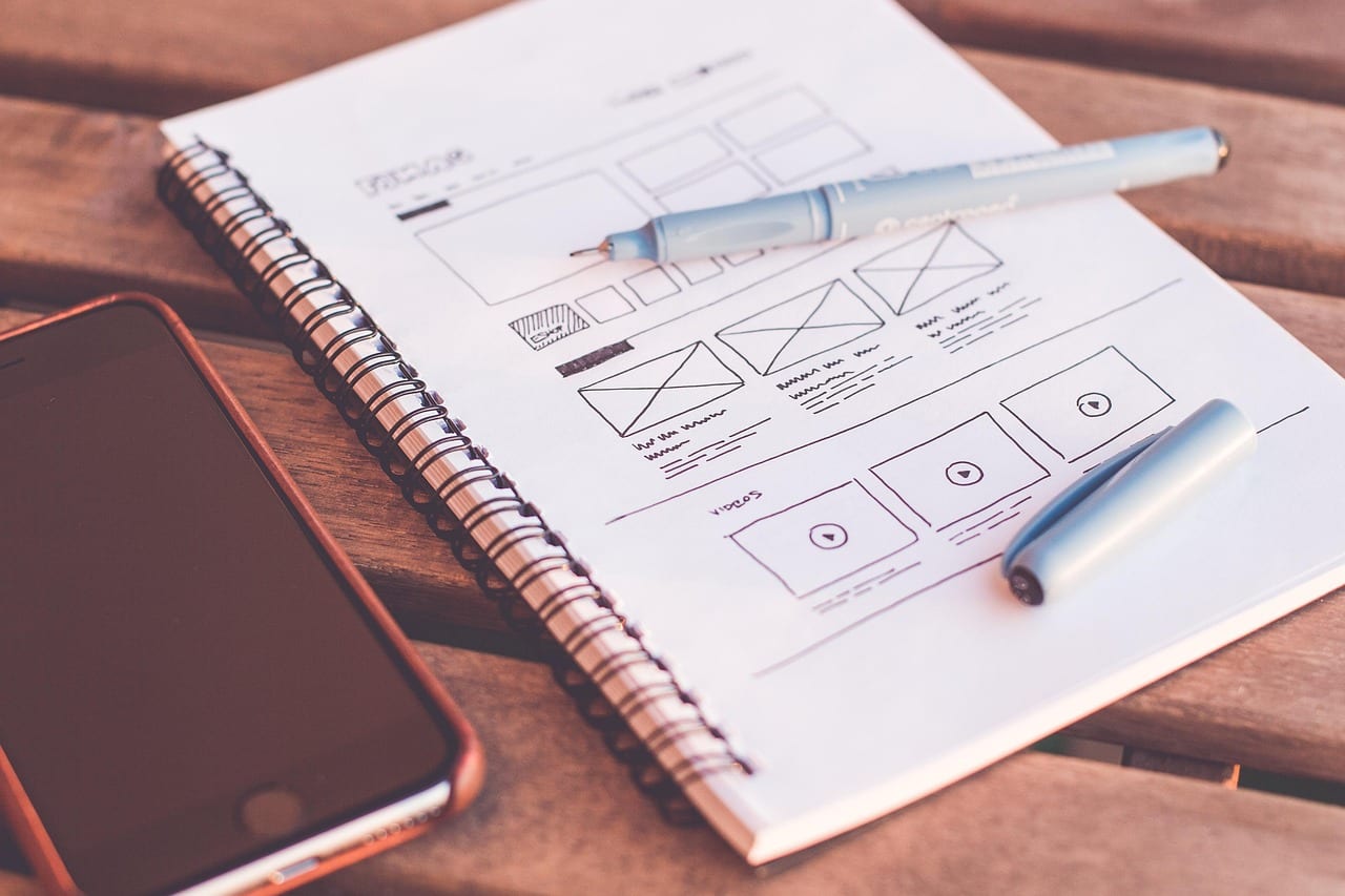
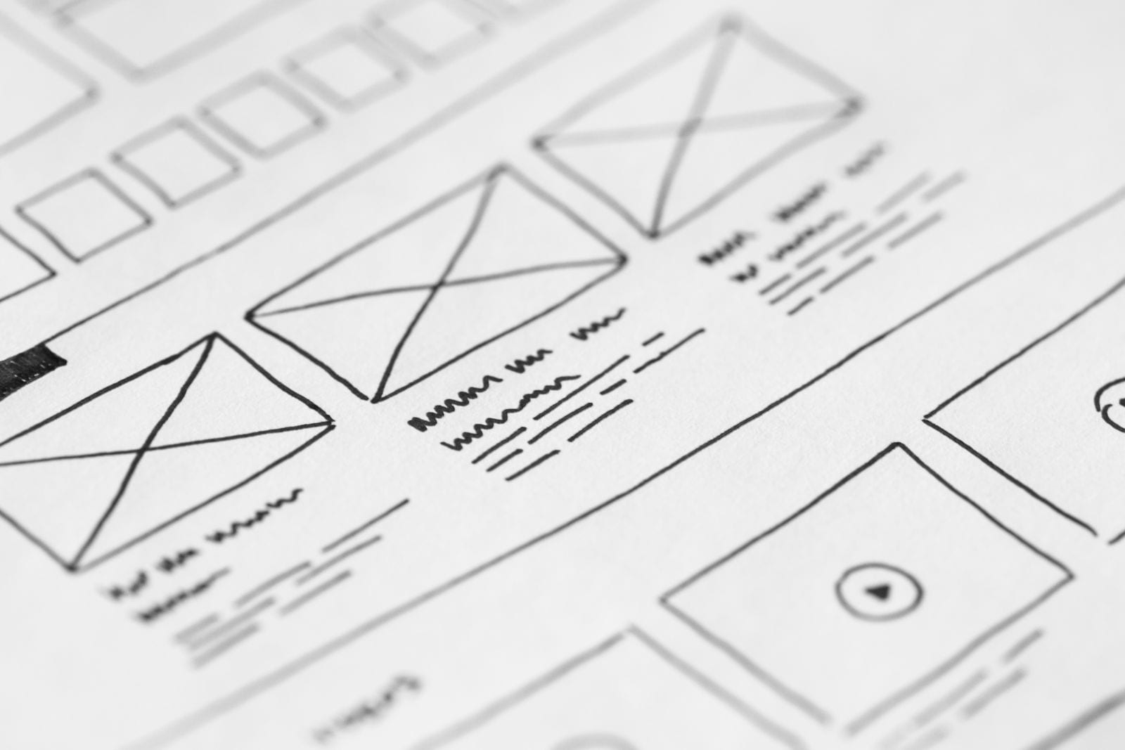
This is why the visual language of the conventional layout (logo top-left, navigation top-right, prominent hero section, clear call-to-action) isn't boring. It's a trust signal. It says: I work the way you expect me to work.
Learn how we build sites that pass the 50ms test
Jakob's Law: The Rule That Explains Everything
In 2000, Jakob Nielsen, one of the world's foremost usability researchers, articulated what's now called Jakob's Law:
Users spend most of their time on other websites. This means they prefer your site to work the same way as all the other sites they already know.
This isn't a design preference. It's a cognitive economics principle. Every time a user encounters a pattern they already recognize (navigation at the top, clickable logo that goes home, footer with contact info and legal links), their brain doesn't have to work. The mental model they've built from thousands of prior web sessions applies instantly.
When you break that model with an unconventional layout, you force the user to expend cognitive effort just to figure out how your site works. That effort comes directly out of the trust and attention they'd otherwise spend evaluating your offer.
What we've seen: Clients who come to us after building "creative" custom websites almost always share the same frustration: their visitors leave without contacting them. The site wins compliments at dinner parties but doesn't produce leads. The creative investment comes at the direct expense of usability.
The research confirms this pattern repeatedly. Baymard Institute, which has logged over 200,000 hours of UX research, consistently documents that familiar interface patterns reduce errors and improve task completion across every category of website they benchmark. And across Nielsen Norman Group's 50+ years of user studies, consistent navigation patterns repeatedly show up as a primary driver of user satisfaction. These aren't aesthetic preferences. They're measurable behavioral outcomes.
What the Data Says About "Creative" Navigation
If you want to see the cost of unconventional design in raw numbers, look at what happens when you hide the navigation.
The Nielsen Norman Group conducted a study with 179 users across six websites, comparing three navigation treatments: hidden navigation (hamburger icon only), visible navigation (persistent top links), and a combined approach. The results aren't close.
On desktop, users with hidden navigation:
- Used the navigation 44% less often (27% usage rate vs. 48% for visible nav)
- Were 39% slower at completing tasks
- Rated tasks as significantly harder (2.6 vs. 2.1 on a 7-point difficulty scale)
- Discovered less content overall
The insight here isn't that hamburger menus are bad on mobile, they're a reasonable trade-off when screen real estate is limited. The insight is that hiding navigation to look sleek on desktop sacrifices real user outcomes for aesthetic preference. That's not a design decision. It's a business decision, and it's the wrong one.
The F-shaped reading pattern, documented by NNg's eye-tracking studies across 232 users, compounds the problem. Real users don't read web pages. They scan them in an F-shape, front-loading attention to the top and left of the page. Your navigation bar sits in the most-read zone on the entire screen. Moving it or hiding it doesn't make your site more interesting. It moves critical information out of the only spot your users reliably look.
The Anatomy of a Layout That Actually Works
Let me demystify the "boring" conventional structure that every well-converting website shares.
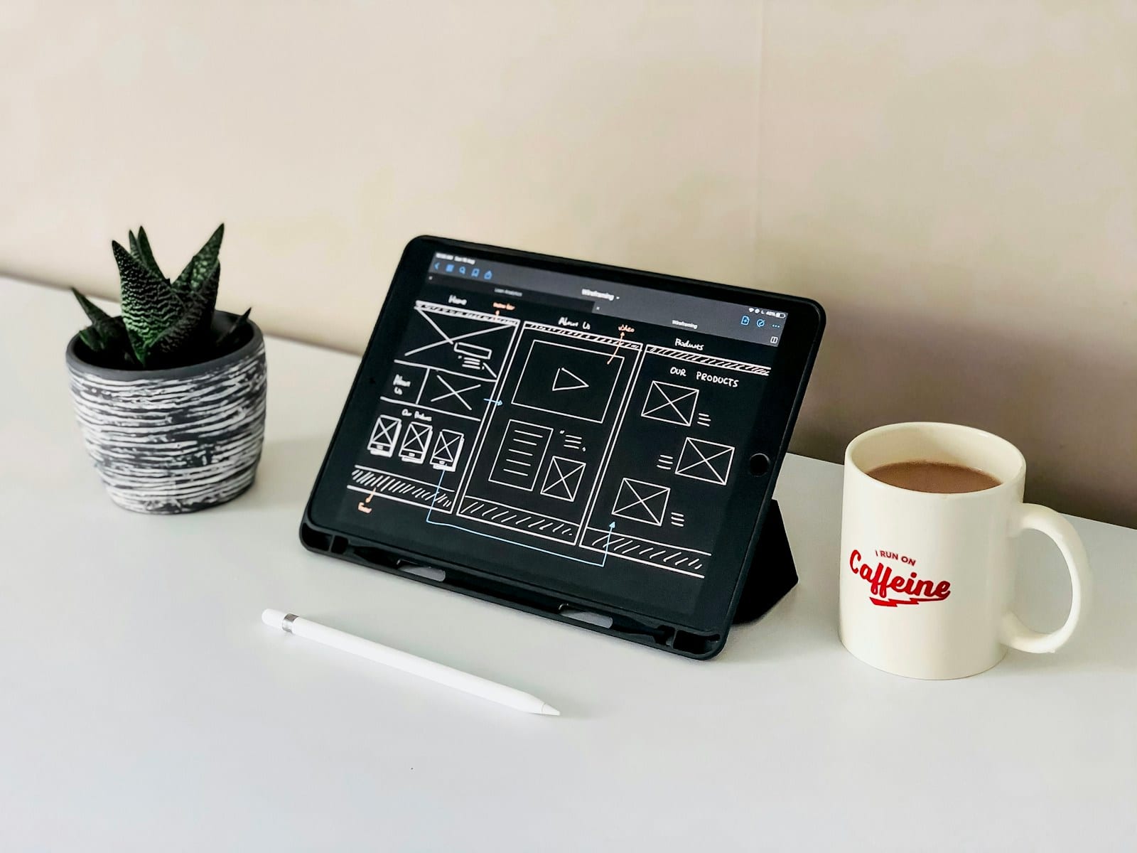
The sticky top navigation exists because users need to orient themselves and move around without scrolling back to the top. It's not a design cliché. It's a functional tool. After arriving from a referral link, 50% of visitors immediately use the navigation to orient themselves (HubSpot Web Design Stats, 2023). That nav bar is doing real work.
The hero section (full-width, headline, subheadline, primary CTA) exists to answer one question in under 3 seconds: Am I in the right place? It's not a blank canvas for visual experimentation. It's the most valuable real estate on your site, and it converts in direct proportion to how clearly it answers that question.
The persistent footer exists because users who scroll to the bottom are highly intent. They've read your content, they want to take action, and they need contact information, legal links, and navigation without hunting. A footer is where committed visitors convert.
None of these elements are conventions because nobody thought harder about it. They're conventions because 30 years of web usage data have proven they work.
The Real Secret to Standing Out
Here's the thing nobody tells you: your layout isn't what makes your site memorable.
According to a 2025 Maze study, 94% of consumers name easy navigation as the most important digital feature they look for. Easy navigation is table stakes. It's not your differentiator, it's your entry ticket. Once you've built the foundation users expect, then you have room to differentiate.
The sites that actually win in competitive local markets don't win because of diagonal layouts or hidden navigation. They win because of:
Speed. A site that loads in under 2 seconds on mobile converts at 2.5× the rate of one that loads in 5 seconds (Portent research). That's a bigger competitive gap than any visual redesign. Lighthouse scores of 95+ are achievable and they directly affect both Google rankings and user behavior.
Clarity. A value proposition that tells a specific visitor (a "plumber in St. Louis County looking for a new website") that they're in exactly the right place. Not marketing copy. A clear, direct answer to: what do you do, who is it for, why should I trust you?
Proof. Real client results. Real photos. Real testimonials. Google reviews embedded from verified accounts. These build trust faster than any visual treatment. According to B.J. Fogg's Stanford Web Credibility Project, 75% of users make credibility judgments based on website design, and that design quality includes the substance of what's presented, not just visual flair.
Conventional layout + these three ingredients is what separates a high-converting professional website from the competition, not a menu that spins in on hover.
The websites we build at Untap Web aren't going to win a design award for layout innovation. They're going to show up first in local search, load in under 2 seconds on a 4G connection, and turn visitors into phone calls. That's a different kind of winning, and it's the kind that matters to a service business owner.
See the structure behind a conversion-optimized layout
Caveats Worth Acknowledging
This argument has limits. There are genuine cases where design-forward, convention-breaking layouts make sense, and pretending otherwise would be dishonest.
If your brand's entire identity is its aesthetic (a luxury watchmaker, an experimental architecture firm, a high-end fashion label), then your website's design novelty signals exactly the kind of premium positioning your audience expects. The experience of navigating your site IS part of the brand promise.
There's also a difference between unconventional and thoughtful. Breaking conventions deliberately, with a clear reason and exceptional execution, can create memorable experiences. The danger is breaking conventions because you didn't know why they existed.
What doesn't change: if your goal is converting visitors into paying customers for a service business, the evidence is unambiguous. Convention wins.
Questions
Does having a unique website design hurt conversions?
It depends on what 'unique' means. Unconventional navigation (hidden menus, no visible header links, diagonal layouts) consistently reduces task completion and conversion rates. Nielsen Norman Group found hidden navigation cuts discoverability by nearly half. Brand personality expressed through color, imagery, and copy doesn't hurt conversions. Structural novelty almost always does.
Why do most professional websites use the same top-nav, hero, footer structure?
Because 30 years of web usage have made that structure the baseline user expectation. Jakob's Law states that users spend most of their time on other websites, so they arrive at yours with a pre-built mental model. When your layout matches that model, users spend zero effort figuring out how the site works and focus entirely on your offer.
Are there any cases where unconventional website design works?
Yes, for brands where the design experience IS the product. Luxury fashion houses, experimental art studios, and interactive storytelling platforms can win with avant-garde layouts because their audience expects to be challenged. For service businesses, contractors, consultants, and local companies where the user needs to find a phone number and trust a stranger, convention wins decisively.
What makes a conventional website stand out if all layouts look the same?
Speed, clarity, and proof. A site that loads in under 2 seconds, presents a concrete value proposition above the fold, and shows real client results immediately differentiates itself from 90% of local competitors, all while maintaining familiar navigation. Standing out through performance and trust beats standing out through layout confusion.
How does Untap Web approach website layout and design?
Every site we build follows proven layout conventions (sticky top navigation, structured hero section, clear CTAs, persistent footer) because those elements are optimized for the way real users behave. We make your site stand out through speed (95+ Lighthouse scores), content quality, and trust signals, not by reinventing navigation in ways that confuse your customers.
Sources
- Nielsen Norman Group — Jakob's Law (opens in a new tab)
- Lindgaard et al. — Attention Web Designers (50ms Study), Behaviour & Information Technology (opens in a new tab)
- Nielsen Norman Group — Hamburger Menus and Hidden Navigation Hurt UX Metrics (opens in a new tab)
- Nielsen Norman Group — F-Shaped Pattern Reading (opens in a new tab)
- Baymard Institute — Homepage & Navigation UX Best Practices 2025 (opens in a new tab)
- Baymard Institute — UX Statistics from 200,000+ Hours of Research (opens in a new tab)
- Forrester Research — Leaving User Experience to Chance Hurts Companies (opens in a new tab)
- Maze — 30+ Essential UX Statistics 2025 (opens in a new tab)
- Laws of UX — Jakob's Law (opens in a new tab)
- HubSpot — 25+ Web Design Statistics for 2023 (opens in a new tab)
- Stanford Web Credibility Project — B.J. Fogg et al. (opens in a new tab)
Next step
Custom website
A new site designed and built for your business. Not a theme, not a page builder, and fast on a phone. Stand Up and Growth have fixed prices, so your bid is instant. Custom work is reviewed by Chris, who gets in touch to talk it through.